A small restoration company that aims to beautify and preserve the historical buildings in Tellico Plains
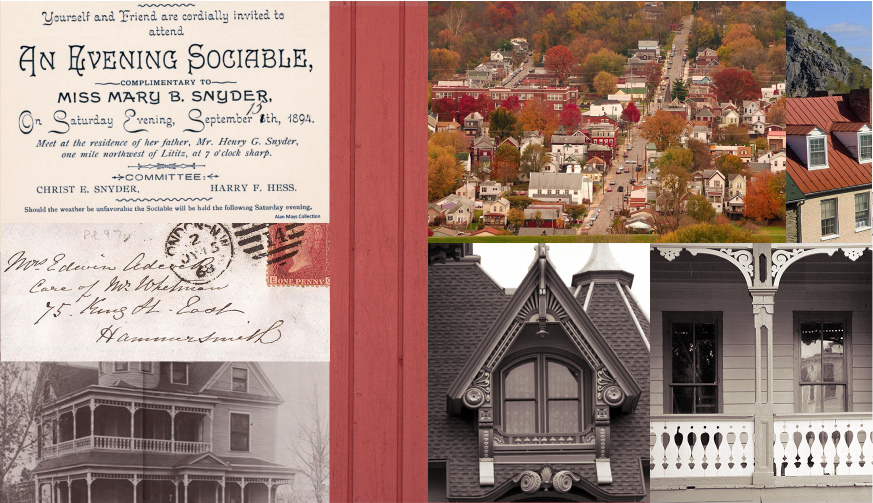
The client specified that they wanted Many Hats to feel "classic," but not "stodgy." I began by examining elements from local historical architecture, as well as the individual personalities of each member of the company. The elements prioritized were tourism, nature, warmth, history, and friendship.
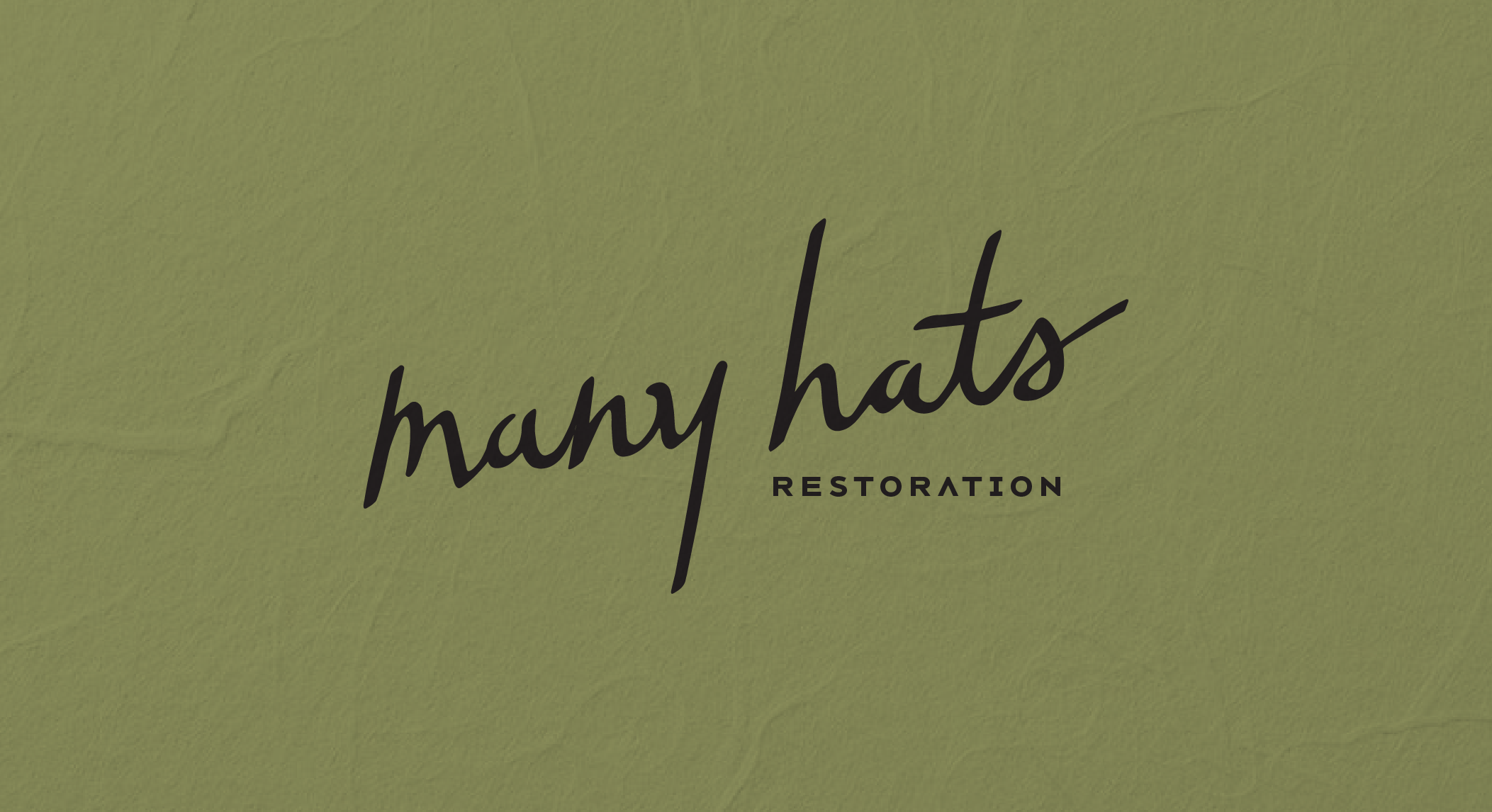
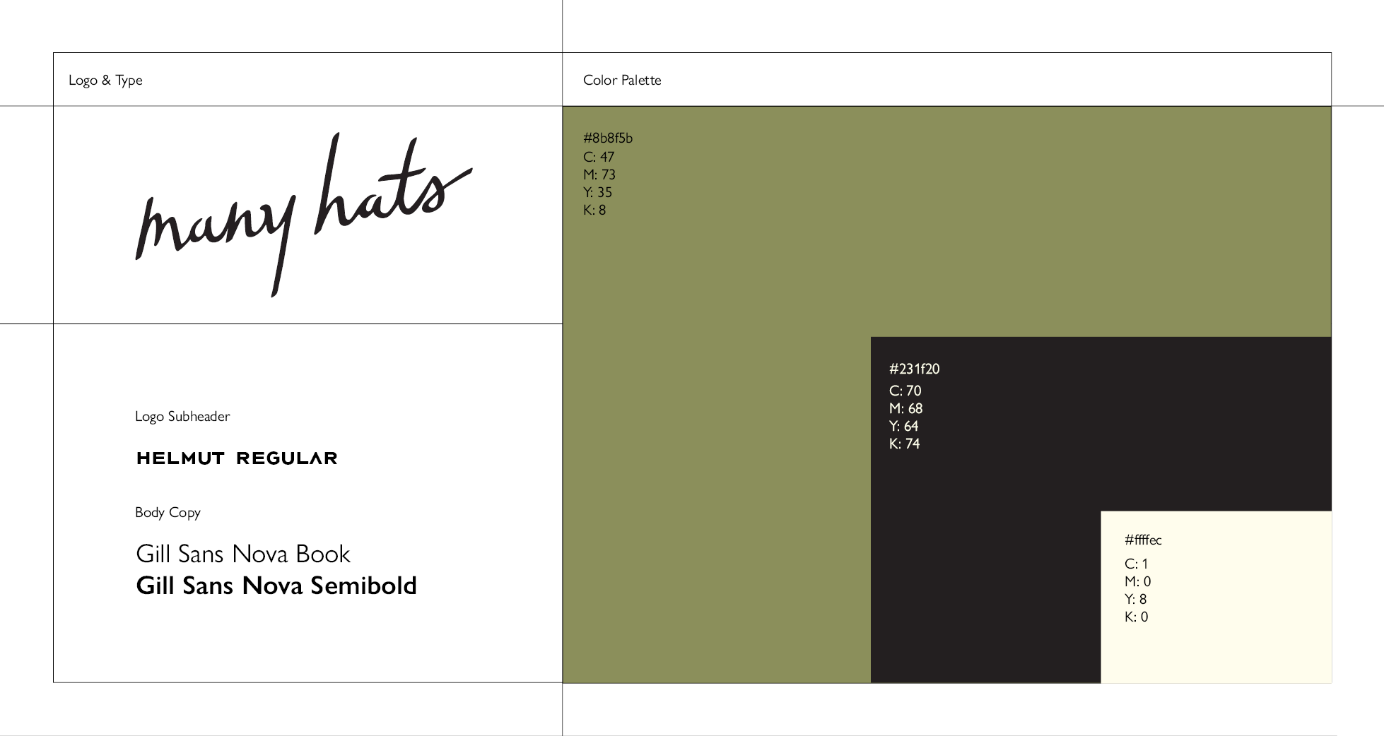
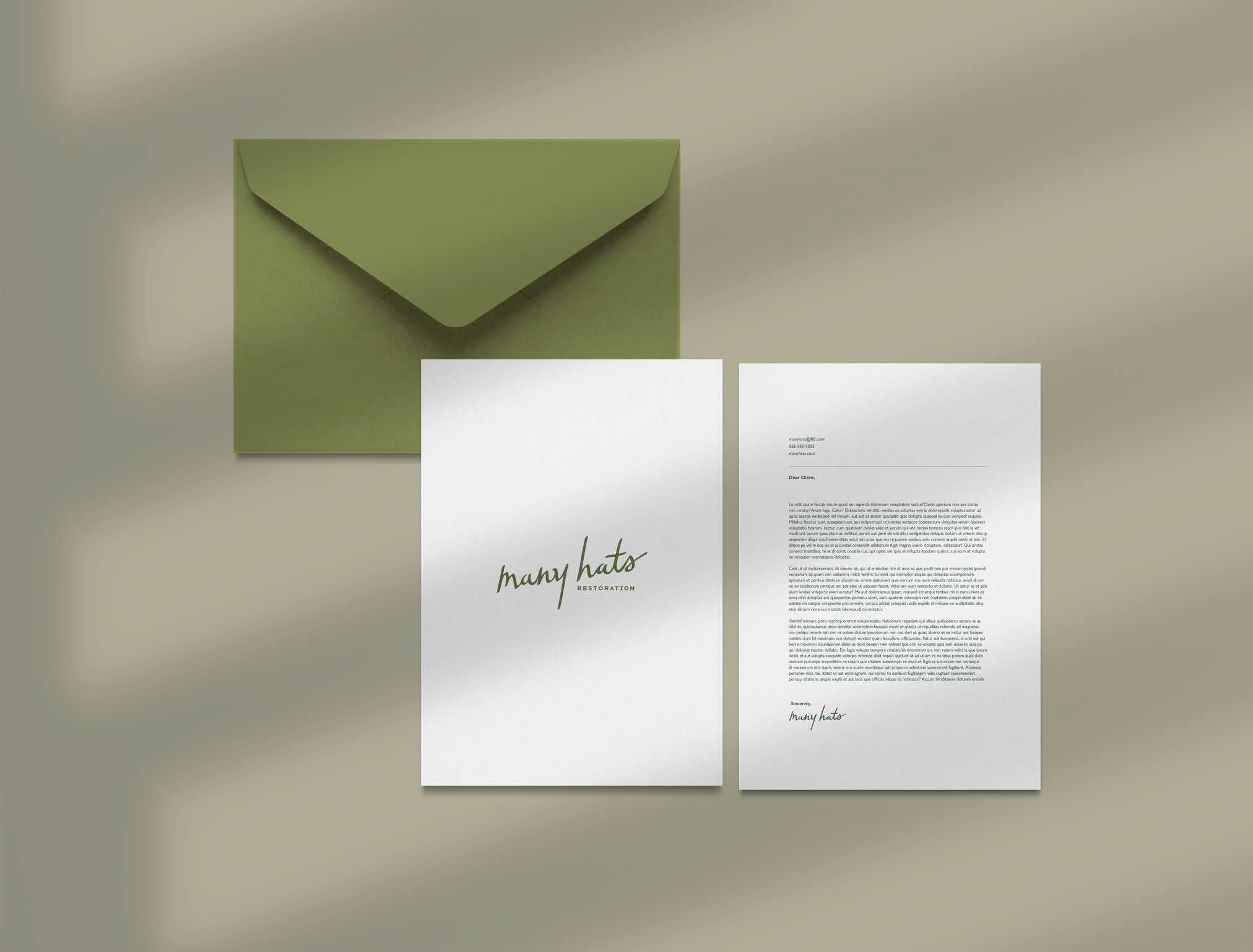
After many iterations, the clients and I settled for a clean, signature logotype that captured the personal touches that each member of Many Hats adds to the group. The red that was originally in the moodboard changed to an olive green to emphasize Tellico Plains' primary means of income: nature tourism.
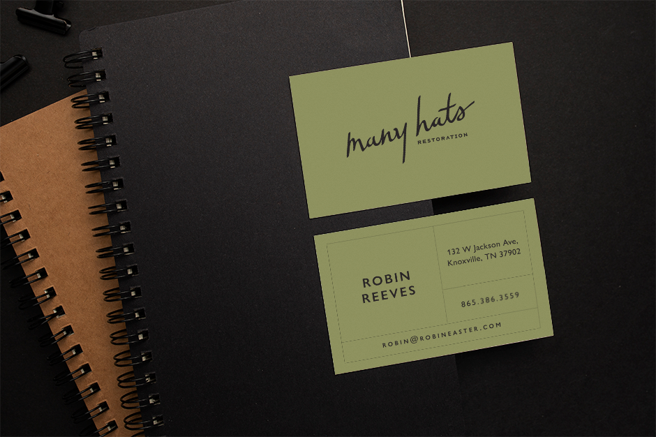
The client simply requested the logotype, as well as business card and simple stationery designs.