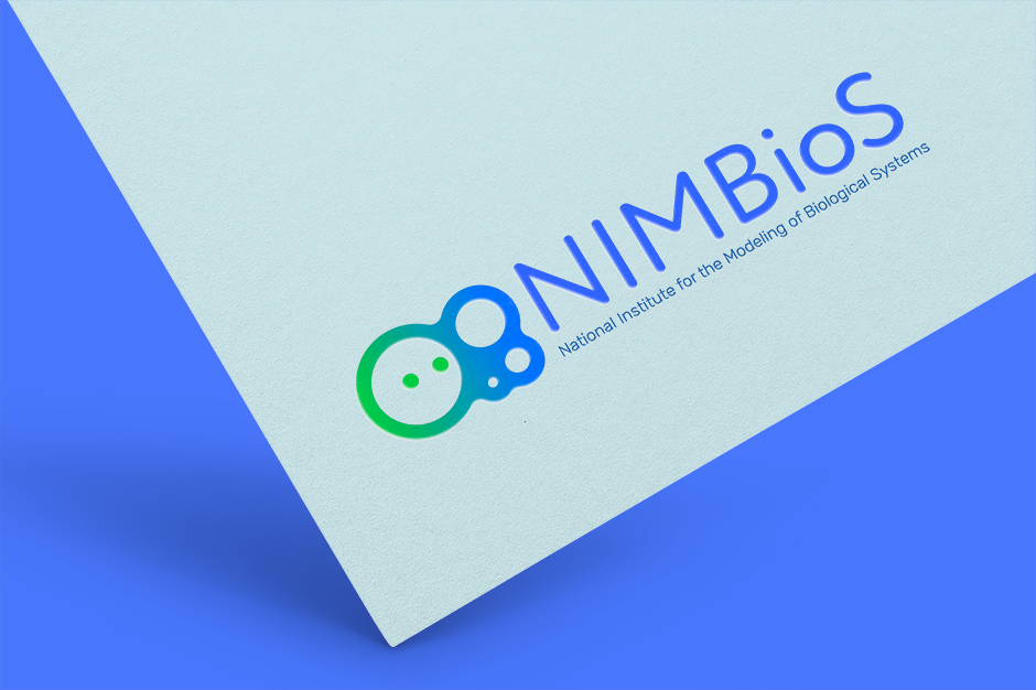
A brand refresh for a company focused on connecting and facilitating interdisciplinary research.
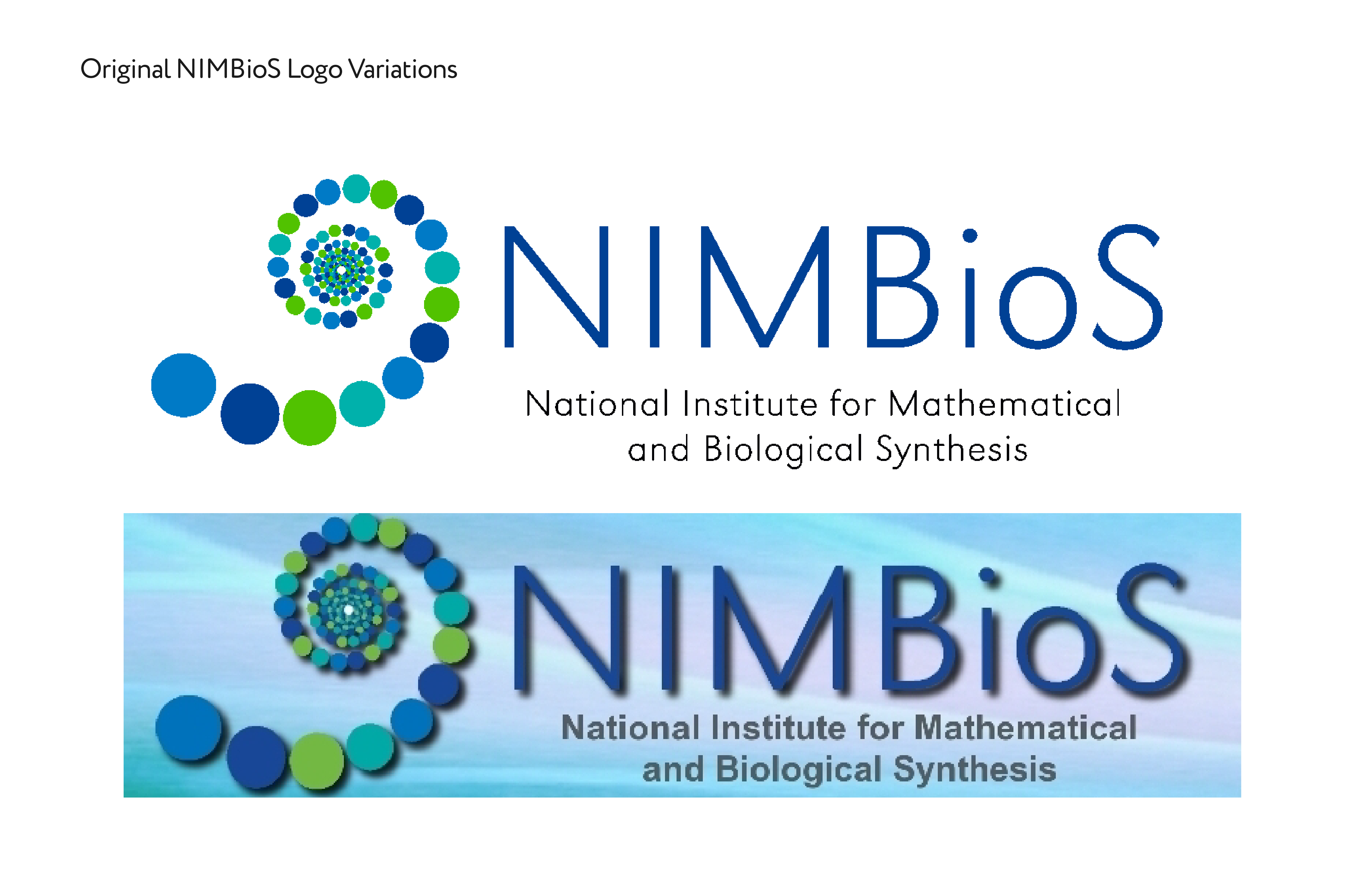
NIMBioS felt that their logo was outdated and not in line with their new brand, as they had transitioned from connecting researchers to connecting and facilitating research.
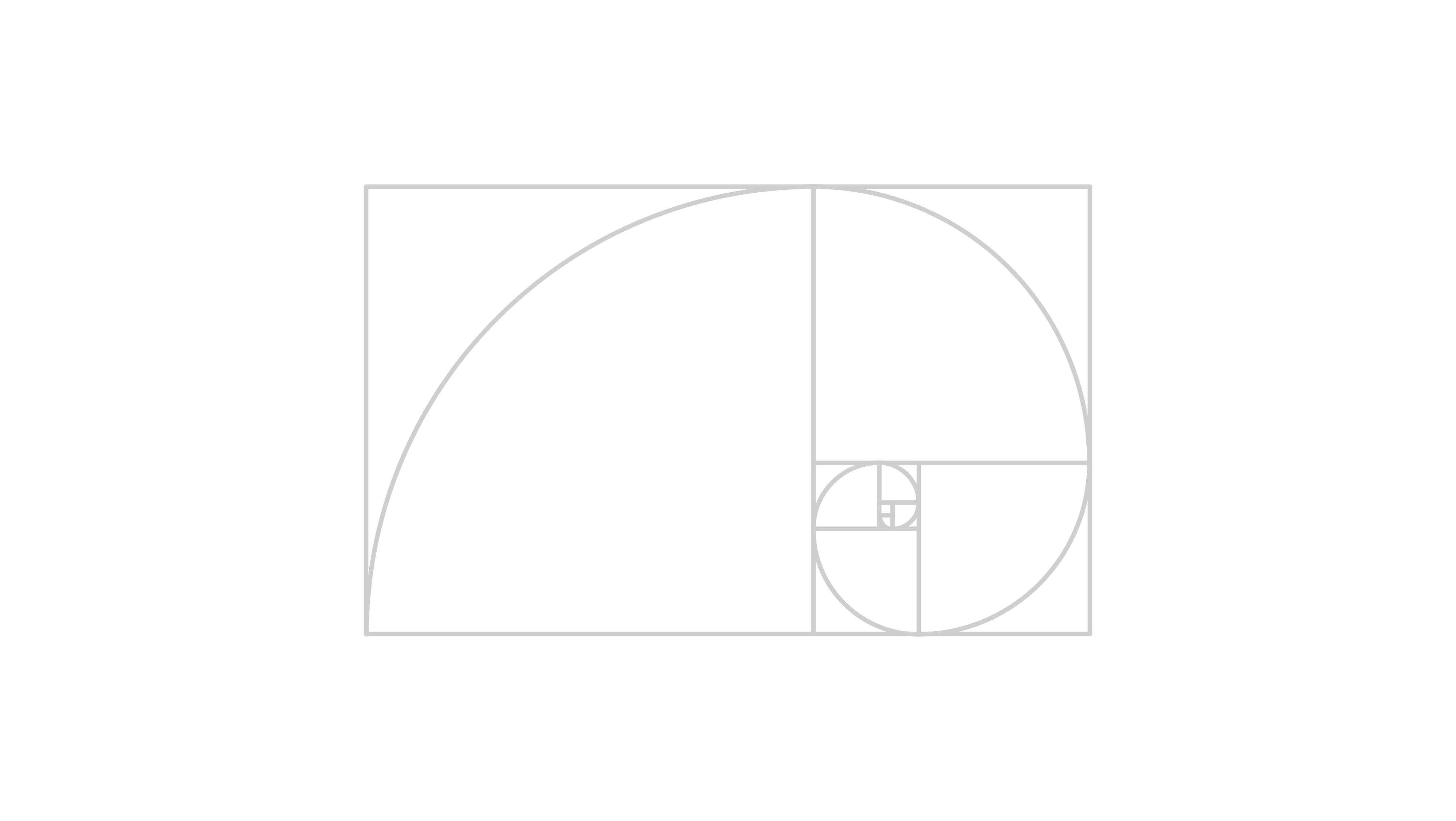
The original NIMBioS logo utilized the golden ratio because it is a universal math and science concept. The client wanted us to retain this core element of the logo. We decided the best concept involved keeping the small "dot" elements, in addition to the spiral.
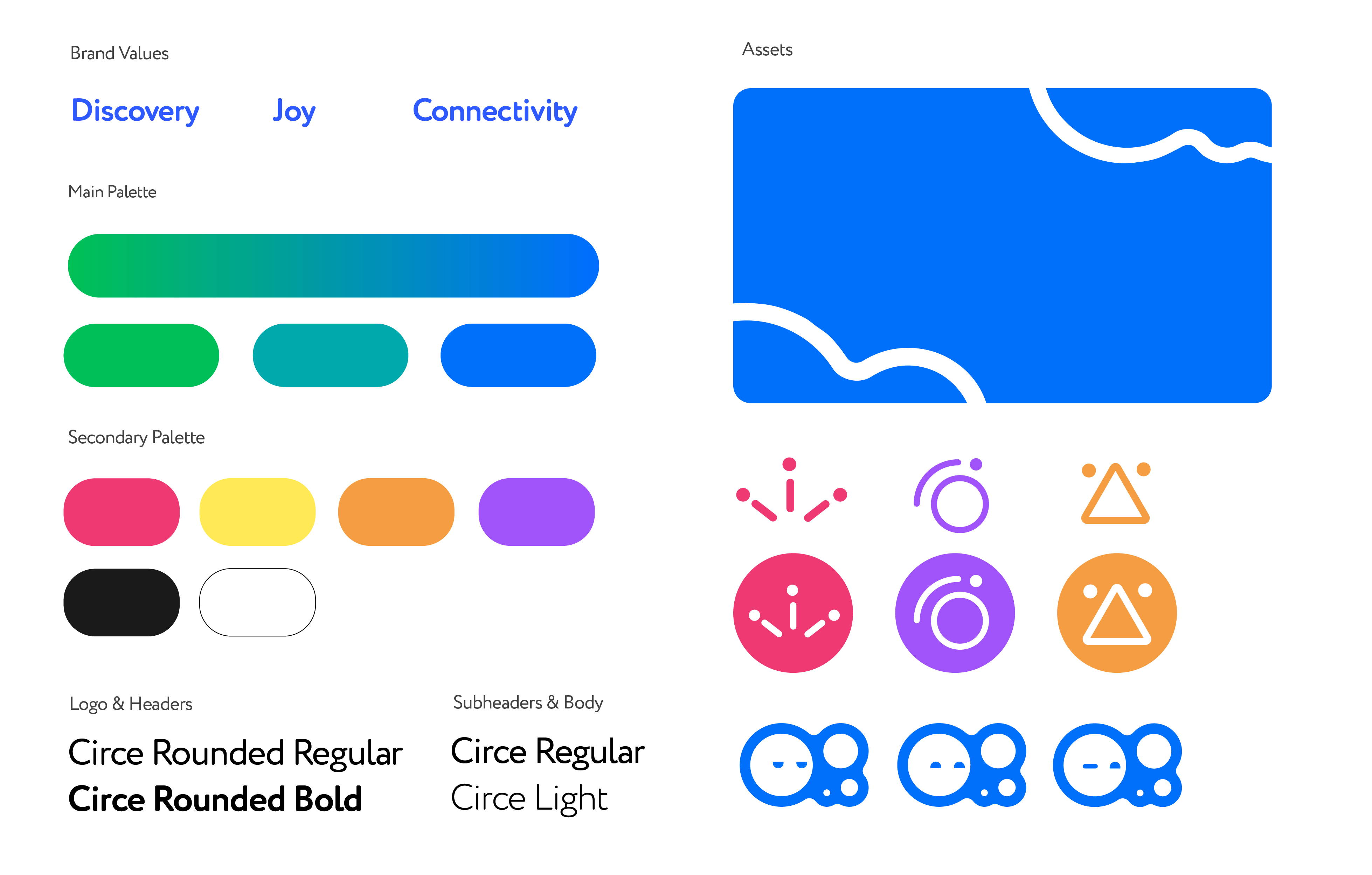
Joy, discovery, and connectivity were core values that the brand wanted to portray. Our team decided that the aesthetic would be threading the needle between fun and clean.